
The projects below demonstrate the work IDEAS fellows and trainees accomplished during their Visualization for Multi-Dimensional Data (FSS Visualizations) Course. The images featured in each presentation utilize a combination of visual tools, including–but not limited to–Matplotlib, Paraview, Vtk, and D3.js. Please read the student quotes for a synopsis of each project.
Alex Gurvich: 3D particle viewer in WebGL (Firefly)
 Click image to experience interactive visualization
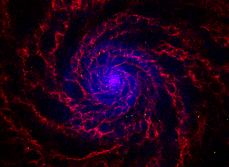
This viewer allows us to explore data from our group’s hydrodynamic galaxy formation simulations. One challenge in previous approaches in rendering the full resolution data, because the data sets often contain millions of points. One novel aspect of my project is that I developed an algorithm for progressively rendering data points as you zoom into an area, allowing the full resolution volume to be explored on small scales. I did this by calculating the rotating geometry of the camera “frustum” (volume probed by the camera) and filtering out particles that lay outside it, choosing to render only particles that would actually appear in the camera. By saving the computational expense of rendering particles outside the camera I was able to increase the number of particles rendered inside the camera. This frugality allows me to progressively render all the gas particles as long as I have zoomed in close enough to a region of interest, making for a more accurate column density estimate.
This project is written in HTML, CSS, and javascript.
Michael Katz: A Gravitational Universe from Illustris Black Hole Mergers

Click image to view video visualization
The visualization initially shows a zoom of the first two Massive Black Holes (MBHs) to merge in the Illustris cosmological simulation at a universal age of around 1 billion years. After the merger takes place, I zoom out to the entire Illustris box and illustrate the MBH binary evolution with gravitational waves. When MBHs merge, a dot is added with a color representing the strength of its gravitational wave signal as it is created. This color is also used in the gravitational wave leaving that binary. As the video evolves, it tells the viewer the size of the box, how many mergers have taken place, the age of the universe, and the redshift. The size of the box is important because it represents the expansion of the universe and how these black holes spread out over time. As these mergers take place, a Seaborn KDE contour plot is updated by showing a scatter dot for each new binary. This allows me to see the evolution of the parameter space observed in these mergers.
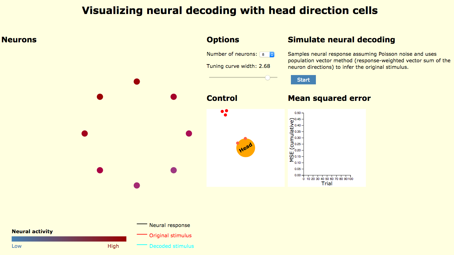
Jimmy Kim: Head Direction Cells
 Click image to experiment with interactive visualization
This project is an interactive visual demonstration of the data collection process for my research on neural decoding. In order to facilitate visualization, I chose a tangible real-life example. Head direction cells, as the name suggests, encode the direction (in a 2D plane) towards which the head is pointing. As each neuron has a preferred direction for which it is most responsive, a sensible approach was to have them organized in a ring. The color of the neurons was then used to represent their expected amount of activity, determined by both the input direction as well as the tuning curve parameter. With the view of allowing the user to gain a sense of this relationship, both factors have been set to be adjustable. Finally, the user can also run a graphical simulation of sampling actual neural responses with Poisson statistics, which are then decoded with a simple population vector method (where the decoded direction is given by the vector sum of the preferred directions, weighed by the corresponding neuronal activity). The resulting mean squared error, once it converges with enough number of trials, constitutes a data point for the actual research.
The project was written entirely in HTML, CSS, and JavaScript supplemented with the D3 library.
Jordan Nelson: Electronics on the molecular scale
Click image to view video visualization
The visualization is summarized in a Jupyter notebook and has three components:
(1) A movie of the vector representation of the magnetic moment I measure in my experiments (refocusing into an ‘echo’), composed with ffmpeg.
(2) A surface plot of a simulation of the experiment (from an analytical expression in the literature) using matplotlib.
(3) 2-D Bokeh plots of a simplified simulation of the data with interactive widgets.
