
The projects below demonstrate the work IDEAS fellows and trainees accomplished during their Visualization for Multi-Dimensional Data (FSS Visualizations) Course. The images featured in each presentation utilize a combination of visual tools, including–but not limited to–Matplotlib, Paraview, Vtk, and D3.js. Please read the student quotes for a synopsis of each project.
Srutarshi Banerjee:
 Click image to experiment with interactive visualization
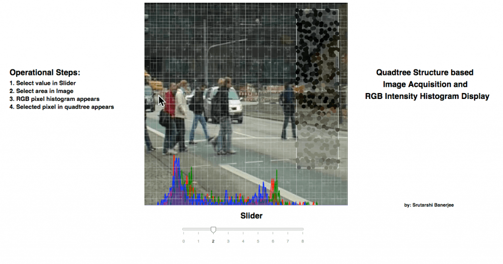
The FSS – Visualization project has been developed based on the concept of Image Compression, depending on quad tree structure. The work is done with the help of d3 javascript library and html. Initially, the image is loaded and subsampled in random manner. Based on the subsampled image pixels, the quad tree structure is selected. The image is stored in canvas data format. However, the quad tree is stored in the form of svg data format. The quad tree structure is loaded on top of the image in translucent appearance….
The interactive visualization allows the User to select a region in the image. Once, an image is selected, the selection shows the pixels randomly subsampled in that region and shows as 5 times magnified. Corresponding to the subsampled points inside the selected region, the RGB data of each pixel is extracted and forms a histogram in the bottom of the canvas for each of R, G and B pixels corresponding to the subsampled pixels.
Guoping Li:
Click image to experiment with interactive visualization
In this project, D3.js was chosen to visualize these datasets. D3.js has an advantage of creating animation. And the chemical reaction is a dynamic process as well. So D3.js is suitable for visualizing the kinetics of the reaction process.
There are two challenges when I was working on this project. The first challenge is to use D3.js to parse multiple CSV files into a single element. The second challenge is to update the legend bar simultaneously when the data is updating. The innovation here is to combine the two elements (legend bar and plotting) into a single updating function.
Using this visualization is easy. The user should first host a local server in their PC/MAC because the script involves loading local data files. When the local server is hosting, the user should navigate to the folder where the scripts and data files are stored. Then simply open the index.html in a web browser, then the user can watch the plotting. There is only one button for animation, which is the ‘Next Time Point’ button. When the user clicks this button, the plotting of next time interval should appear and then replace the plotting of last time interval.
The result of this visualization provides users a straightforward understanding of this block copolymer’s phase transition process. The fluorescence intensity jumping at 75 min is a strong evidence that this block copolymer is precipitating out of the solution and forming micelles.
Alice Lucas:
 Click image to experiment with interactive visualization
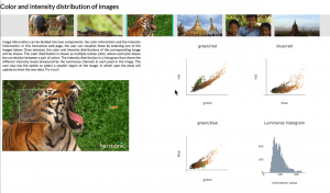
Images, while being highly visual by nature, can actually be represented in many different ways. There exists many types of information in a given image, for example regarding the frequency, color, or greyscale intensities. In this project, we aim to look into some of these properties, more specifically focusing on the color distributions of natural images. We ask questions such as, do the different color channels correlate with one another? Is there a lot of variation between the image channels? How do color distributions differ given different images?
This project was built using html and javascript. The plotly.js library was used to plot the histogram and 2d scatter plots. The d3.js library was used to allow for “brushing” capabilities, i.e., letting the user select different regions in the image. The choice of the use of these two higher level libraries was a natural one, as these allow to (relatively) effortlessly plot data, in addition to enabling interaction with the user.
Given a selected image by the user, three scatterplots are shown. Each point in the scatterplot corresponds to a pixel in the image, where the color of the point corresponds to the color of the pixel. Three different scatterplots are shown, one for each pair combination of colors red, green, and blue. The data to plot these scatterplots is read from different .csv files, where each .csv file contains a table of pixels and corresponding intensity values in the RGB space. This csv file was obtained using MATLAB, and the pixels were extracted from the original image downsampled by 8 (as to minimize the number of points shown in the scatter plot). These scatterplots show the correlations between different colors, as well as provide an idea as to the distribution of colors in a selected frame.
Similarly, given a selected image, a bar plot which corresponds to the histogram of the greyscale intensity is shown. The data to make this scatterplot was obtained from a csv file, which again was created through MATLAB, using the corresponding image, this time downsampled by four. The values in the csv file correspond to the ‘y’ channel of the image, the luminance channel. This luminance channel may be seen as a way to measure the “intensity” content of the image. Looking at the histogram provides an idea regarding the ranges and variance in intensity in the whole image.
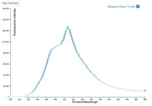
Lin Sun: Visualizing the Emission Distribution and Spectra of UCNP and AuNP Superlattices

Click image to view additional project details
This code will allow direct visualization of the emission spectra of DNA-assembled up conversion and gold nanoparticle superlattices. Due to the complex nature of the system, both viewing how the sample emits at different locations at each individual wavelength and how the emission spectrum is like at each location will help provide insights into how the system behaves.
The top plot provides a 2D map of emission distribution. By the slider on top to choose different wavelengths, thus allowing quick comparison between the emission distribution at different wavelength. This would provide insights the effect of crystal shape and orientation on the emission spectrum. The bottom plot contains a 2D map of emission distribution summed over the entire spectrum. By clicking on the 2D map, we can pick any point on the image and plot out the emission spectrum, which enables detailed analysis at picked location.
The plots are made with bokeh and written and viewed in Jupyter Notebook (the html file is too large due to the large data size). This is advantageous for my future data analysis due to it’s interactive features. The main challenge of this project is making an interactive 2D image in bokeh, which seems to have limited examples online.
