The projects below demonstrate the work IDEAS fellows and trainees accomplished during their Visualization for Multi-Dimensional Data (FSS Visualizations) Course. The images featured in each presentation utilize a combination of visual tools, including–but not limited to–popular visualization tools and libraries such as Matplotlib, Bokeh, D3.js, Paraview, and three.js. Please read the student quotes for a synopsis of each project.
Eve Chase
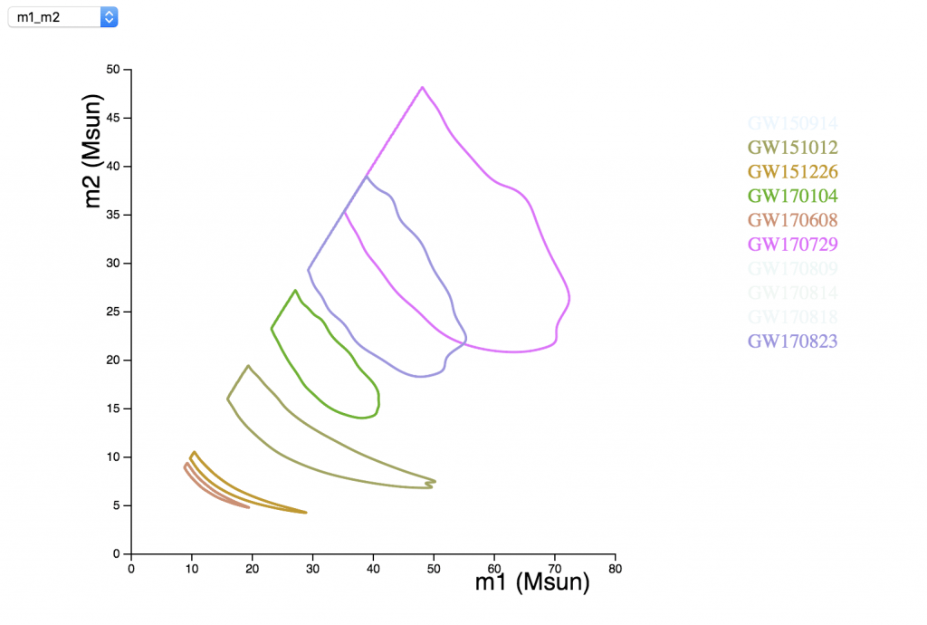
Click image to experiment with interactive visualization.
LIGO and Virgo’s first and second observing runs resulted in ten detections of binary black hole systems and one binary neutron star. We measure numerous astrophysical parameters for each gravitational wave detection, resulting in posterior distributions for each parameter.
This tool allows the user to explore relationships between pairs of parameters, by plotting two-dimensional probability density functions of the parameters. All contours correspond to 90% credible regions. The user has the option to click the label (“GWXXXXXX”) for each event to toggle the contours on and off. A drop down menu allows for the user to toggle between five different figures.
The project was written in HTML, CSS, and JavaScript supplemented with the D3 library.
Cole Kampa
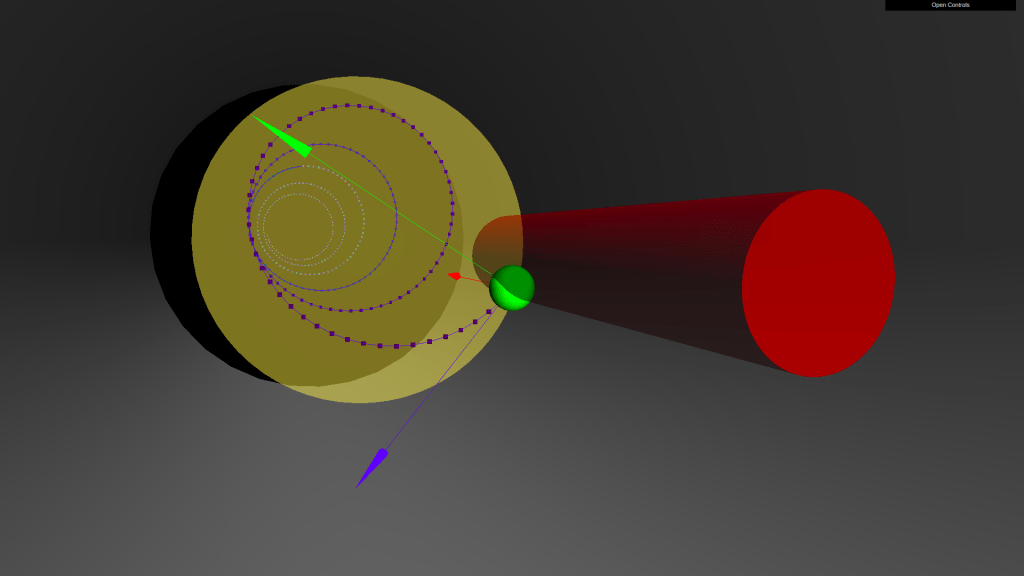
Click image to experiment with interactive visualization.
This visualization is a tool to understand the trajectory of an electron in the nontrivial magnetic fields of the Mu2e Detector Solenoid.
The JavaScript library three.js is used to animate the electron’s trajectory in 3D and display some the Mu2e detector. The magnetic field vector (red), force vector (green), and velocity vector (blue) are fixed to the electron (green sphere).
A simple UI allows the user to start/stop time, change the camera angle, toggle any component of the visualization, and select from the available trajectories. Four trajectories are included that demonstrate the complex design of the magnetic fields.
Monica Rizzo
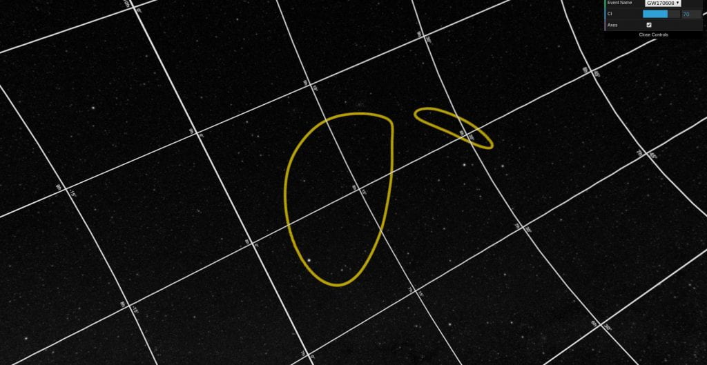
Click image to experiment with interactive visualization
2D localization skymaps are difficult to physically interpret. These maps illustrate where on the celestial sphere gravitational waves from particular sources are thought to have originated from. In order to more intuitively represent these regions on the sky, I created a 3D skymap visualizer.
The visualizer allows the user to select a gravitational wave event, the localization contour of which is plotted over a 3D projection of the celestial sphere. The user can then adjust the confidence interval of the contour, and toggle right ascension/declination axes.
The entirety of the code used to generate the contours is written in Javascript/html. I used the three.js library to render all of the 3D elements and the GUI. The contour plots are generated dynamically using Plotly’s JavaScript Library.
Ziwei Wang
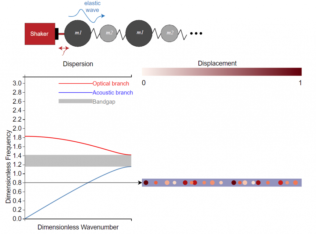
Click image to experiment with interactive visualization.
Diatomic spring-mass lattice is a simple 1D model describing the dynamics of periodic bi-material/bi-layer structures. The dispersion relation between frequency and wavenumber (spatial periodicity of the wave) is often used to study the wave propagation behavior. This demo is made based on D3.js to visualize how the mass ratio and excitation frequency change the behavior of the dispersion and wave propagation. People who are outside or entering this field can understand how the model works easily.
