The projects below demonstrate the work IDEAS fellows and trainees accomplished during their Visualization for Multi-Dimensional Data (FSS Visualizations) Course. The images featured in each presentation utilize a combination of visual tools, including–but not limited to–popular visualization tools and libraries such as Matplotlib, Bokeh, D3.js, Paraview, and three.js. Listed below are student quotes for a synopsis of each project.
Summer Session:
Arnold Chan – Brushing Window Signal Integration Tool
Click image to experiment with interactive visualization.
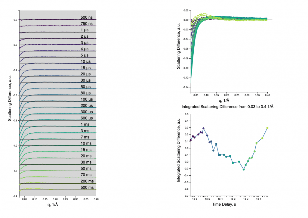
Protein folding and unfolding dynamics can be observed in a time series of x-ray scattering patterns. These curves show characteristic changes in the structure of cytochrome c, a key electron transport chain protein.
To better visualize the changing features simultaneously with their integrated signal kinetics, I created a window brush viewer to explore select regions of these signals. The user can click and drag over the region of interest in the left panel, and even slide the window along the x-axis. Additionally, hovering over the points on the right will highlight corresponding curves on the left. This was created with the tools in the D3.js and formatted into a Javascript/html webpage.
Suman Bhandari – Laser Induced Plasma Micromachining
This visualization project shows how the temperature within the laser-induced plasma varies with time and distance from the center of the plasma. The data is extracted from Ahmed et. al. 2008 paper titled “Spectroscopic study of laser-induced plasma in aqueous media”. Linear interpolation is used to create more data points at different times and distances. The evolution of plasma is a nonlinear process so the temperature on this visualization project is not to be used for scientific purposes.
The visualization is developed on WebGL which is a JavaScript API that can be used within a web browser for rendering interactive graphics. The visualization has some sliders to change the time of the plasma evolution, size of the balls (which represents plasma constituent figuratively), and the opacity of the balls. There are also three sliders that show the cross-section of the plasma in x, y, or z-directions. Users can choose from 3 different color maps and use the mouse to drag the plasma to change the viewing angle. The users can also zoom in and out of the plasma. A plot of temperature as a function of time is also included for different distances (in microns) from the plasma.

